01 · The feeling
Warm, structural, calm under load.
A deal built like a building: architecture, with the home as the outcome, not the paperwork it replaces. Every choice here, a color, a weight of type, the speed of a transition, traces to the morning a coordinator opens their laptop and finds the hard part already handled. One evergreen accent marks a done deal, brass is the single earned metal spent once, and a quiet monospace voice carries every date, amount, and file number.
A capable operating partner.
Confident, specific, useful. The kind of voice that helps you, not the kind that performs.
"Wow, AI" hype.
No superlatives, no exclamation points, no neon. Quiet competence over showmanship.
02 · Logos
One house. Spoken in a few colorways.
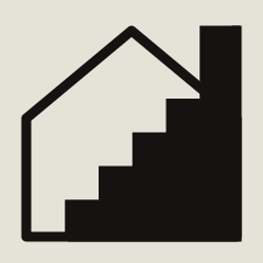
The mark is the house, crisp down to 24 px, and it leads brand-facing moments. The lockup adds the ListedKit wordmark for headers, footers, and partner co-marketing. The Ava logo is the spark, Ava's own mark for product and AI moments. Choose the colorway by its ground, and keep it to one dominant gesture per view.


Approved colorways





The Ava logo
The spark is Ava's own mark, for product surfaces and AI moments. Same rules as the house: pick the colorway by its ground, keep the clear space, and never recolor outside the set.


The spark, on its own
Pulled out of the logo, the spark is a small accent, on a loading state, an AI reply, a “handled by Ava” tag. One per view, never a repeating pattern.



Clear space & sizing

Do
- Pick the colorway by its ground: cream on evergreen, mint on charcoal.
- Lead with the lockup on partner co-marketing.
- Keep at least 1× mark-height of clear space.
- Use the crisp SVG mark down to 24 px.
- Scale proportionally.
Don't
- Stretch, skew, or rotate the mark.
- Apply drop shadows, glows, or outlines.
- Recolor it outside the approved colorways.
- Place it on photography or busy imagery.
- Redraw or recreate it from scratch.
03 · Color
Paper grounds. Evergreen signals done. Brass, once.
Warm porcelain and paper carry almost every surface. Ink holds the type. Evergreen is the one accent, the color of a done deal. A charcoal night ground anchors the bold moments, where mint takes over as the bright accent. Brass is the single earned metal, a fill or marker spent once per view, never a text background.
Evergreen
The one accent, the color of a done deal. Links, focus, primary buttons resolve through green-600 (#2A6147).
Mint
Ava on the dark ground. The bright accent and the night-ground button fill. Not for large fills on paper.
Paper
The dominant day surface. Porcelain (#FDFCF9) raises cards a step above it.
Charcoal
The dark ground for bold, earned moments. Warm near-black, never pure black.
Ink
Warm near-black type on paper. Secondary #3C3931, muted #67635A.
Brass
The single earned metal. A fill or marker on the one human moment per view. Never a text background.
Status is a word beside a color
Meaning never rides on color alone. A status is always spelled out, so the same screen survives down to a plain-text SMS.
Two naming notes to avoid old myths.
Cream #F4F1E8 is a logo colorway and the Windows tile value only, not a surface token: the design-system paper is #F7F6F2 / #FDFCF9. Concrete #E5E2D8 exists only as a logo colorway, not a CSS token. There is no yellow CTA; the primary call to act is evergreen.
04 · Typography
Three voices: serif, grotesk, mono.
Sentient is the signature serif, spent on the hero and the biggest brand moments. Hanken Grotesk is the interface voice: every heading, label, and line of body. Fragment Mono is the ledger: dates, amounts, file numbers, and statuses, always quiet.
Scale
Data stays plain, sentence case is the default.
Numbers, dates, amounts, and statuses are Fragment-Mono evidence, never wrapped in an architectural shape. Use sentence case for headlines, buttons, and nav. Title Case only for proper nouns and named product features. All-caps only on eyebrows at 11 px with tracked letter-spacing.
05 · Voice & tone
The voice of a capable operating partner.
Confident but not loud, specific but not technical, human without being casual. Ava does things: verbs over nouns, second person dominant, short and clear.
Practical
Every word earns its place. Benefits first, no filler, no superlatives.
Specific
"$9.99 per intake." "45 minutes per contract." Numbers are concrete, not vague.
Understated
It does not announce itself. The work speaks. No exclamation points, no hype.
Before & after
Our game-changing AI-powered platform automates your real-estate transaction management workflows.
Ava reads your emails and your contracts. It knows which email belongs to which deal, and tells you what to do next.
Experience the future of transaction management with thousands of satisfied professionals!
First intake free, no subscription. Connect Gmail, upload a contract, and Ava handles the rest.
Leverage cutting-edge contract-reading capabilities to streamline your coordination process.
Ava reads the full contract before you open it: every date, every party, every contingency, including the ones that got missed.
Retired phrases
Don't say
- "Free trial", the product does not have one.
- "AI-powered", a category label that says nothing.
- "Game-changing" / "cutting-edge", hype.
- "Deadline automation", it is deadline tracking.
- "Back office", it undersells what Ava does.
Say this instead
- "First intake free", true and specific.
- "Ava reads your contracts", verbs over nouns.
- Concrete numbers: "under 5 minutes".
- "Deadline tracking".
- "Reads your inbox and your contracts".
Ava is "it."
Ava is a tool, an operating partner, not a person. Refer to it with it/its, never she/her. "Chat with Ava." "Ava reads your contracts." "Ava learns from your edits."
06 · Imagery & shape
Real product first. Architecture, on purpose.
Product UI screenshots do most of the work. On top of an otherwise plain, productive surface rides a governed set of architectural shapes: accents, never wallpaper. No stock photography, no real-estate cliches.
The shape language









Textures
Two governed textures, used as quiet atmosphere behind hero set pieces, never under reading text.
Five rules that keep it from becoming gimmick
Real product screenshots
Real Ava screens in rounded containers with a subtle shadow. The most common image in our materials.
The mark at scale on a night ground
Used large on hero and launch moments, with fluting as quiet atmosphere behind it. A set piece, not a pattern element.
Stock photography
No photos of people, hands on keyboards, houses, sold signs, or keys. Real-estate cliches undercut the brand.
Decorative patterns or shapes on data
Textures like fluting and coursing stay low-contrast atmosphere, never under reading text. Never wrap a number, or a shape becomes gimmick.
07 · Quick reference
The whole guide on one card.
If you only remember a handful of things, remember these. The full rules are above; this is for the moment you are three pixels deep and need a quick answer.
Colors
- Paper#F7F6F2
- Ink#1C1A16
- Evergreen#173627
- CTA green#2A6147
- Mint (on dark)#5FC79A
- Charcoal#141311
- Brass#A8894F
Type
- DisplaySentient
- InterfaceHanken Grotesk
- DataFragment Mono
- Body16 px · 1.65
- H1Sentient 40 · 500
- CasingSentence case
Rules of thumb
- Primary CTAEvergreen
- BrassOnce per view
- Arch radius140 px top
- ShapesOne gesture / view
- DataMono, never in a shape
- ImageryReal UI, no stock
08 · Downloads
Get the assets.
Pre-approved marks and lockups, the design tokens, and the fonts. For a format not listed, email hello@listedkit.com.
Lockup, evergreen on cream
The default lockup for light surfaces.
Lockup, cream on evergreen
For evergreen and dark surfaces.
Mark, evergreen
The house mark, crisp to 24 px.
Mark, mint on charcoal
For night grounds and dark decks.
Design tokens
Colors, the three fonts, radii, and CTA tokens.
Sentient
Display serif. Hero and brand moments.
Hanken Grotesk
Interface and body. The default.
Fragment Mono
Data: dates, amounts, statuses.
09 · Approvals
One last thing.
Anything that uses our name, marks, or product UI in front of an external audience needs a quick review before it ships. We are fast, usually under two business days, and we are on your side.
- Co-branded marketing or partner pages
- Press releases or external announcements
- Slide decks with the mark used at scale
- Anything claiming product capabilities
- New uses of imagery, photography, or illustration
- Internal documents and decks
- Using approved assets in approved contexts
- Email signatures with the lockup
- Anything that follows this guide cleanly
Brand reviews
Email hello@listedkit.com with what you're making, where it'll live, and a draft. We aim for a 2-business-day turnaround.